02.
Japanese Street Food Eindhoven
Branding, Web / UI design, Shopify development
Identity, website design and development for the take-away shop that serves authentic Japanese food to the locals in Eindhoven, the Netherlands.
About
Japanese Street Food Eindhoven is a take-away specialty shop that opened its doors in 2022 with the concept of offering authentic Japanese fried chicken to locals in the Netherlands, aiming to provide a casual and enjoyable experience.
Deriverbles
1. Brand Identity
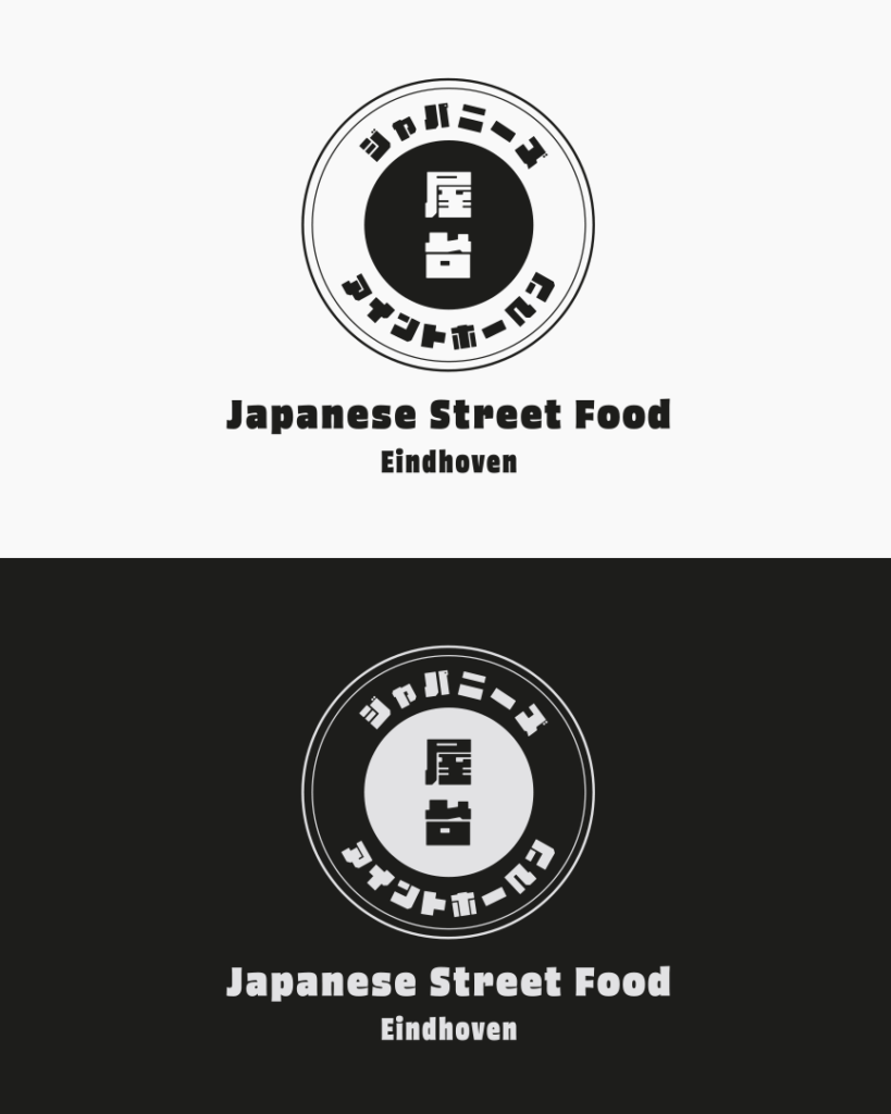
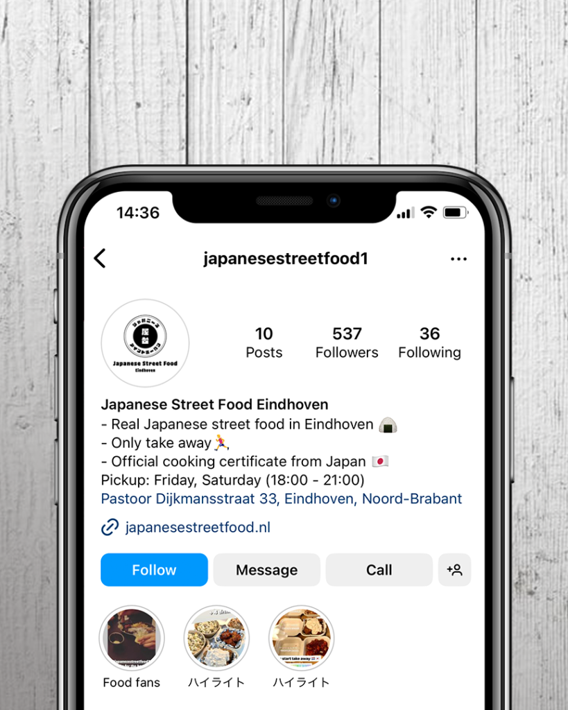
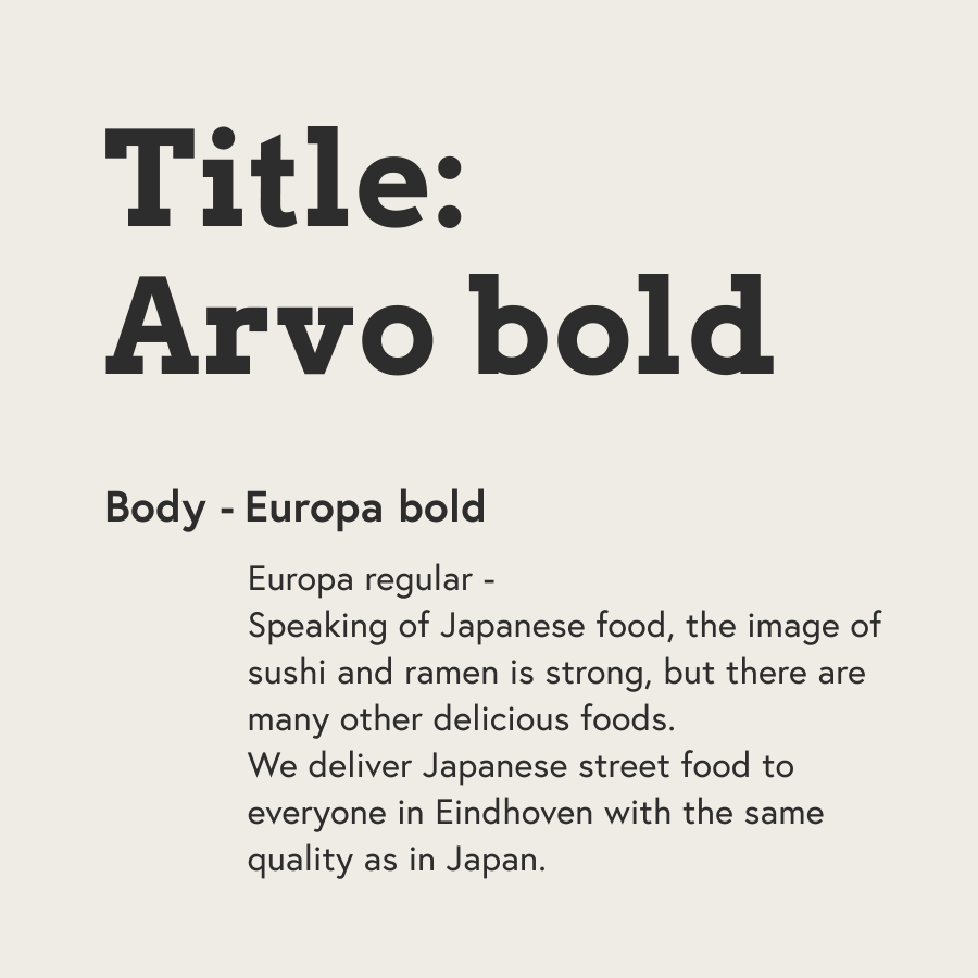
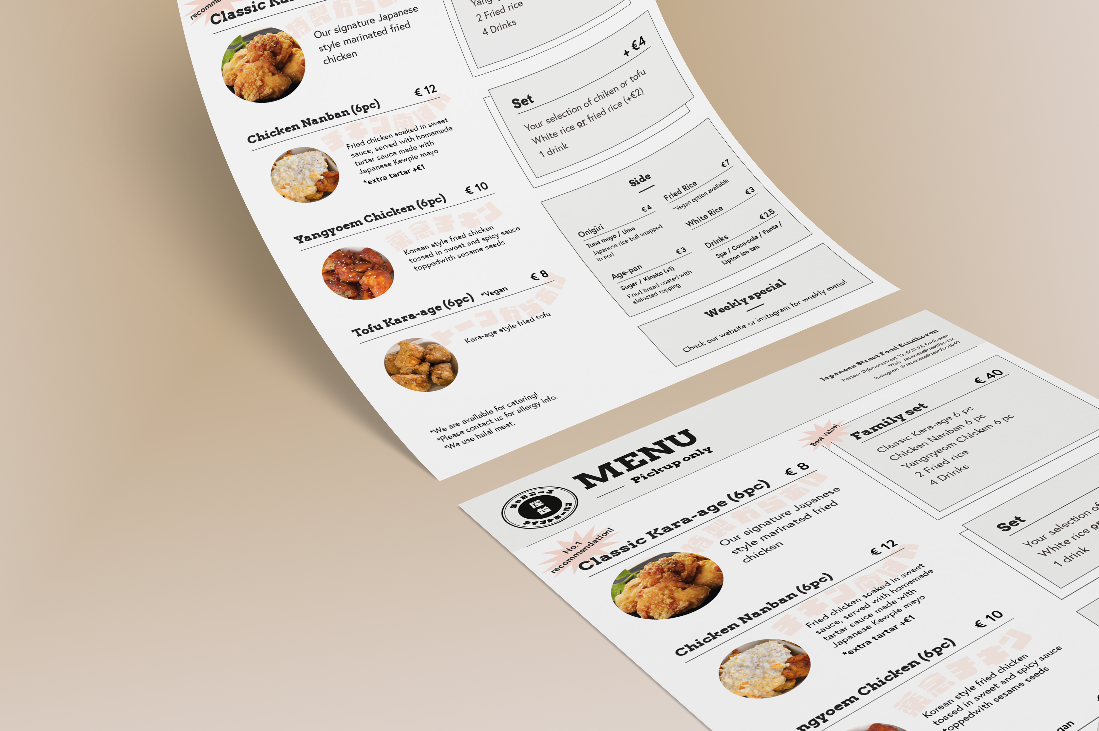
The logo incorporates Katakana characters to emphasize its Japanese cuisine offerings while maintaining a casual atmosphere through its choice of vibrant typography. Careful attention was given to ensure a distinctive logo and brand style across menus and social media content.
In contrast to the logo and fonts, I chose simple and understated colors to create a calm atmosphere. This approach not only makes the shop more approachable but also evokes the sense of minimalism that Western people often associate with Japan.
2. Website
The web design process began with creating a site map and developing a user flow. This was followed by designing a low-fidelity wireframe, then progressing to a visual design and prototyping. Finally, the website was implemented using the Shopify platform.
Sitemap
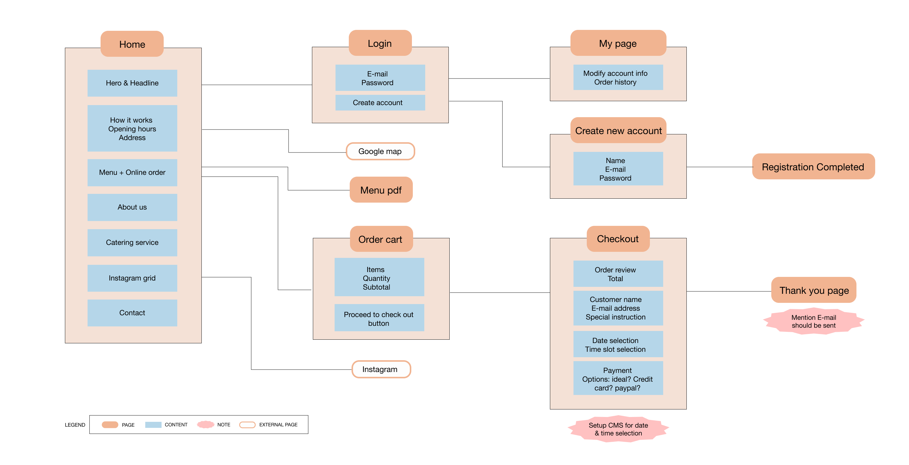
With the client’s request for simplicity in mind, I opted to craft a landing page integrating the ordering system and essential information.
Beyond the landing page, users could access the checkout process and account login/signup.
This streamlined approach ensures users can effortlessly navigate to the ordering section while also ensuring they have access to vital information before placing an order.
User flow
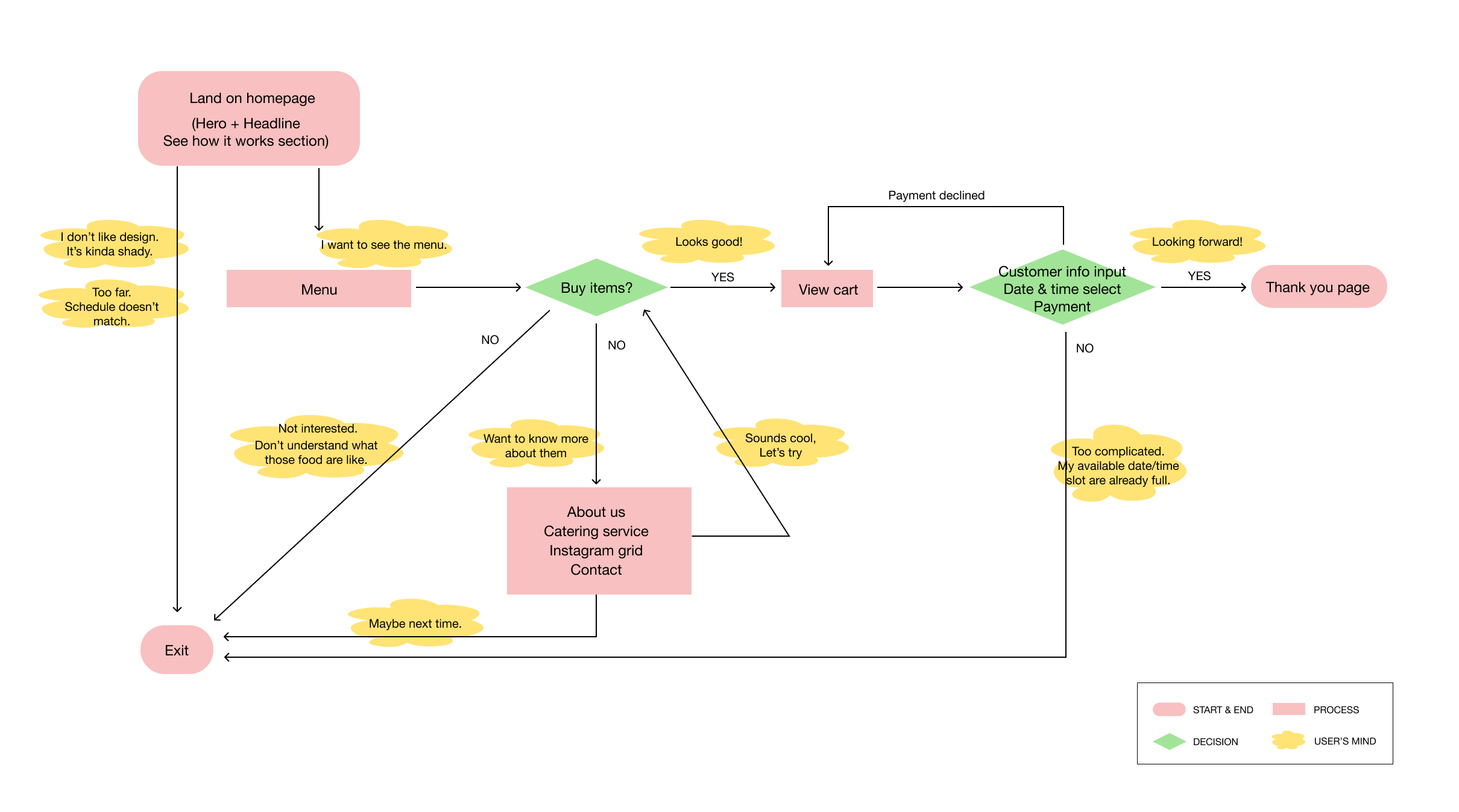
In order to anticipate and visualize the user experience, I crafted a user flow chart to map out the task flow with potential user’s thought process at every step.
This approach ensured the placement of information on the landing page was optimal, contributing to a seamless and efficient overall experience.
Wireframe
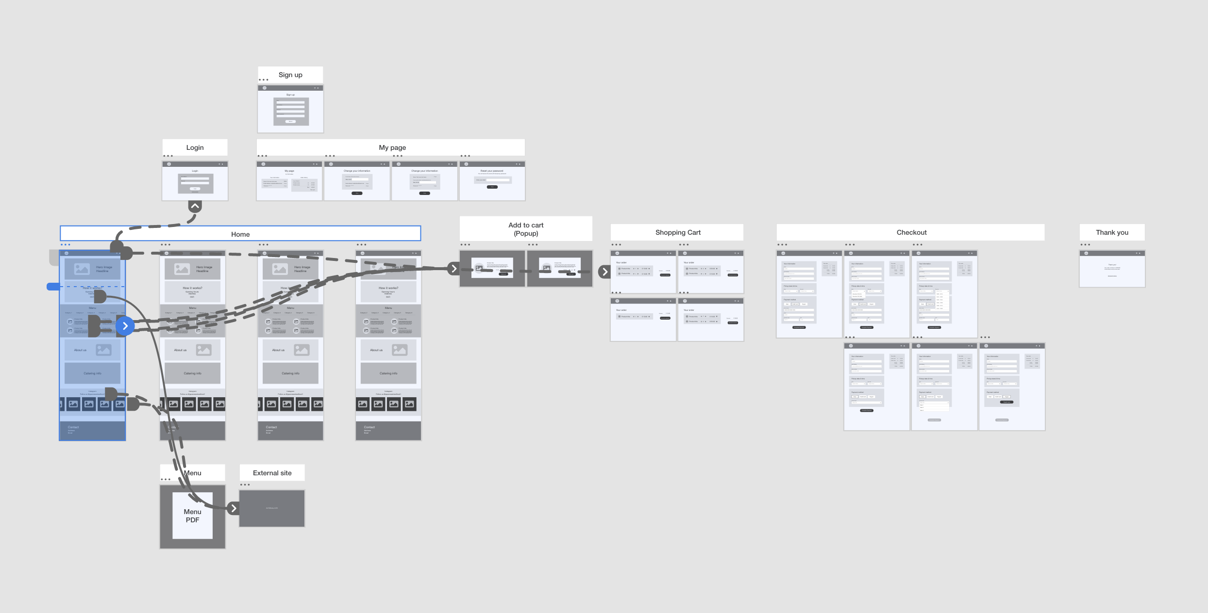
For the subsequent phase, I developed a low-fidelity wireframe to validate the functionality and flow outlined earlier on real devices.
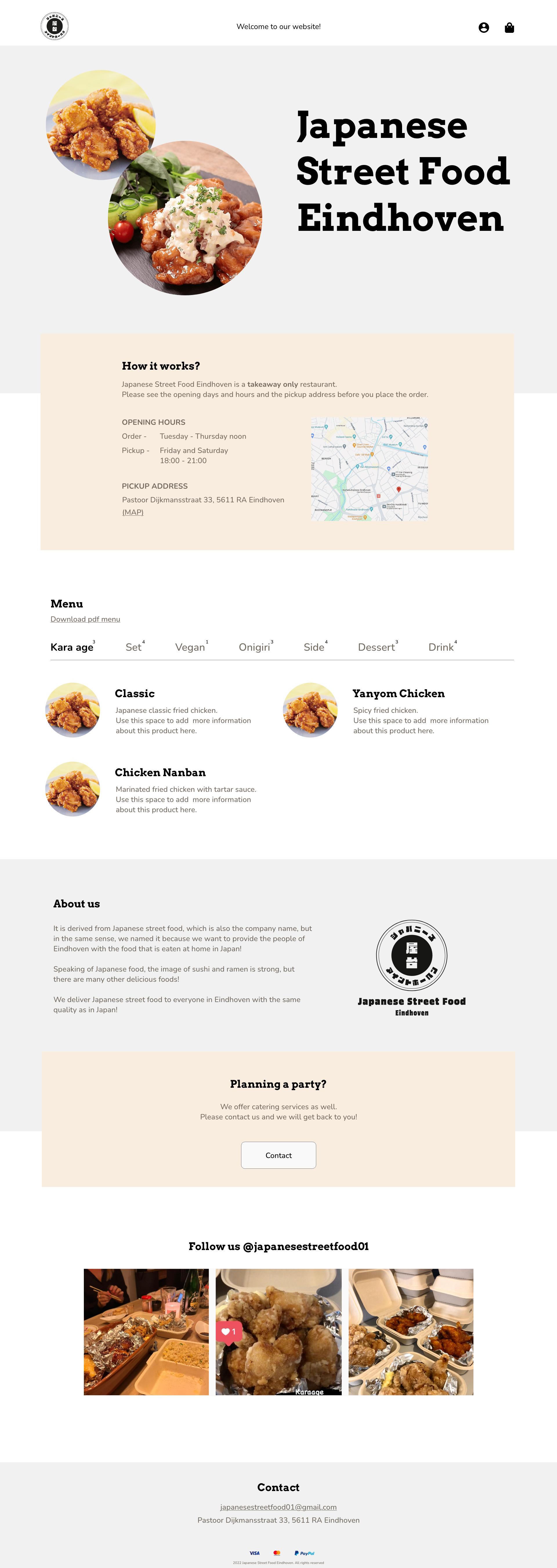

Visual design & Prototyping
In response to the client’s request for simplicity, I approached the visual design with a minimalist aesthetic, avoiding unnecessary embellishments.
Utilizing dynamic typography for immediate impact, I ensured the design maintained a balance between memorability and clarity.
Additionally, to facilitate seamless navigation to subsequent content, I implemented subtle variations in background color, guiding users through the scrolling experience.
Initially, the client took orders via Instagram direct messages and sent payment links individually. With the introduction of the website, the number of orders increased about fourfold, all while maintaining the same open hours of two days a week for three and a half hours each day.
This also significantly reduced the client’s workload in terms of customer communication, order confirmation, and accounting information management.
Year: 2023
Client: Japanese Street Food Eindhoven (NL)
(Please note that the current live version of the website has been modified by the client and does not fully reflect my original design.)
Next
Project
→
03. ROYCE' Town Station Area Map
Signage design